Design & Style
Color & Type
Using quantitative research and qualitative interviews to finalize an effective design plan for MarkIt.
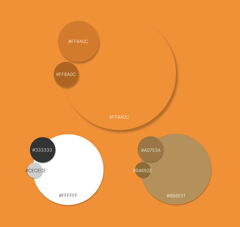
The goal was to invite the user to USE the app. Studies have shown that the color orange has been used often to create a sense of energy, excitement, and creativity in UI/UX Design. Using this bright orange, MarkIt. aims to make the grocery planning process more fun and energetic.
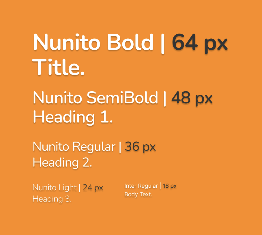
The goal was to inspire productivity without stressing out the user. In UI/UX design, rounded typefaces provide an aspect of friendliness and efficiency to their readers. Nunito and Inter evoke exactly that inviting and productive feeling users should sense with MarkIt.

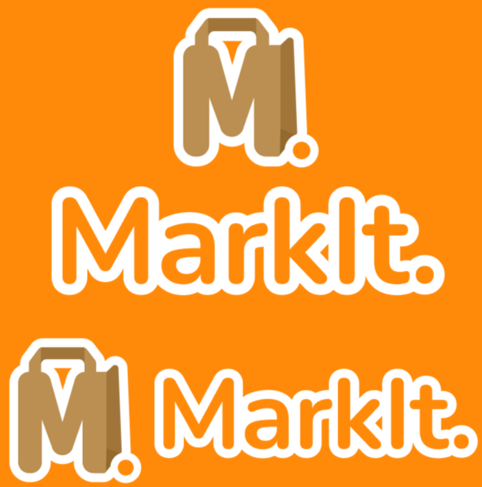

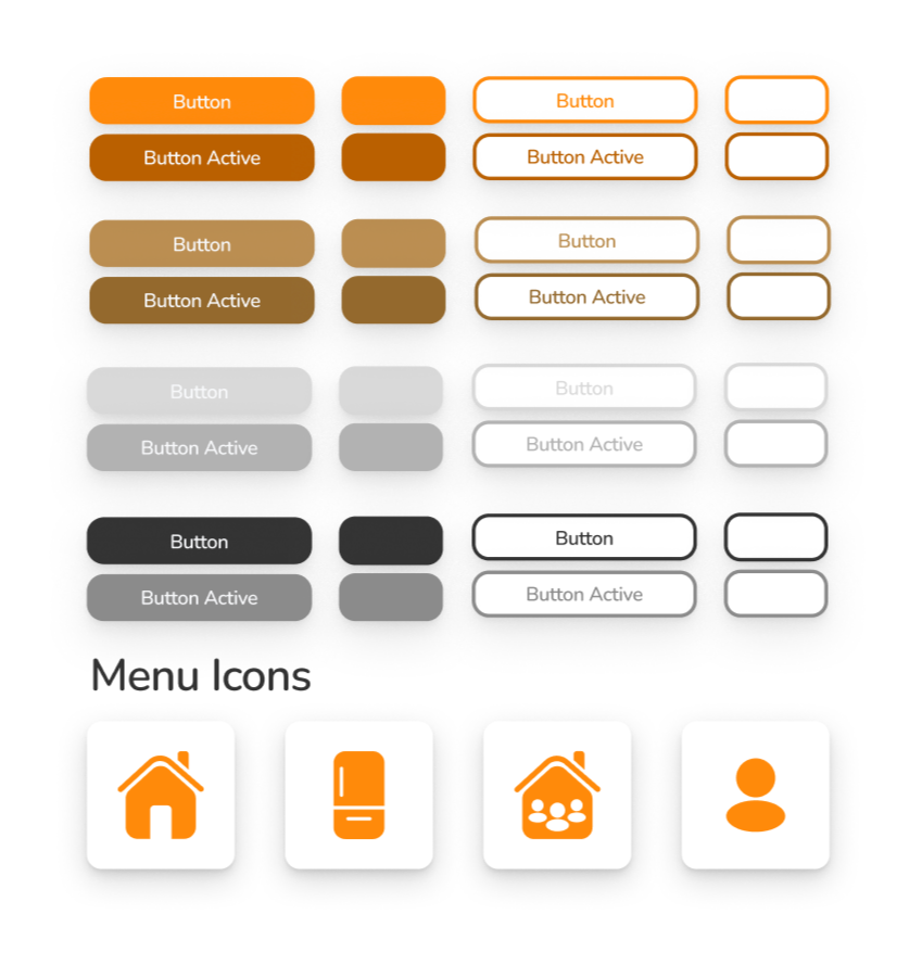
Logo & Iconography
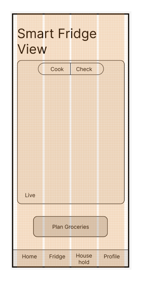
I wanted my icons and buttons to reflect the same friendly and efficient tone. The rounded corners, simple designs, and use of orange communicate this well and invite the user to actually USE the app.
Gridding
& Buttons