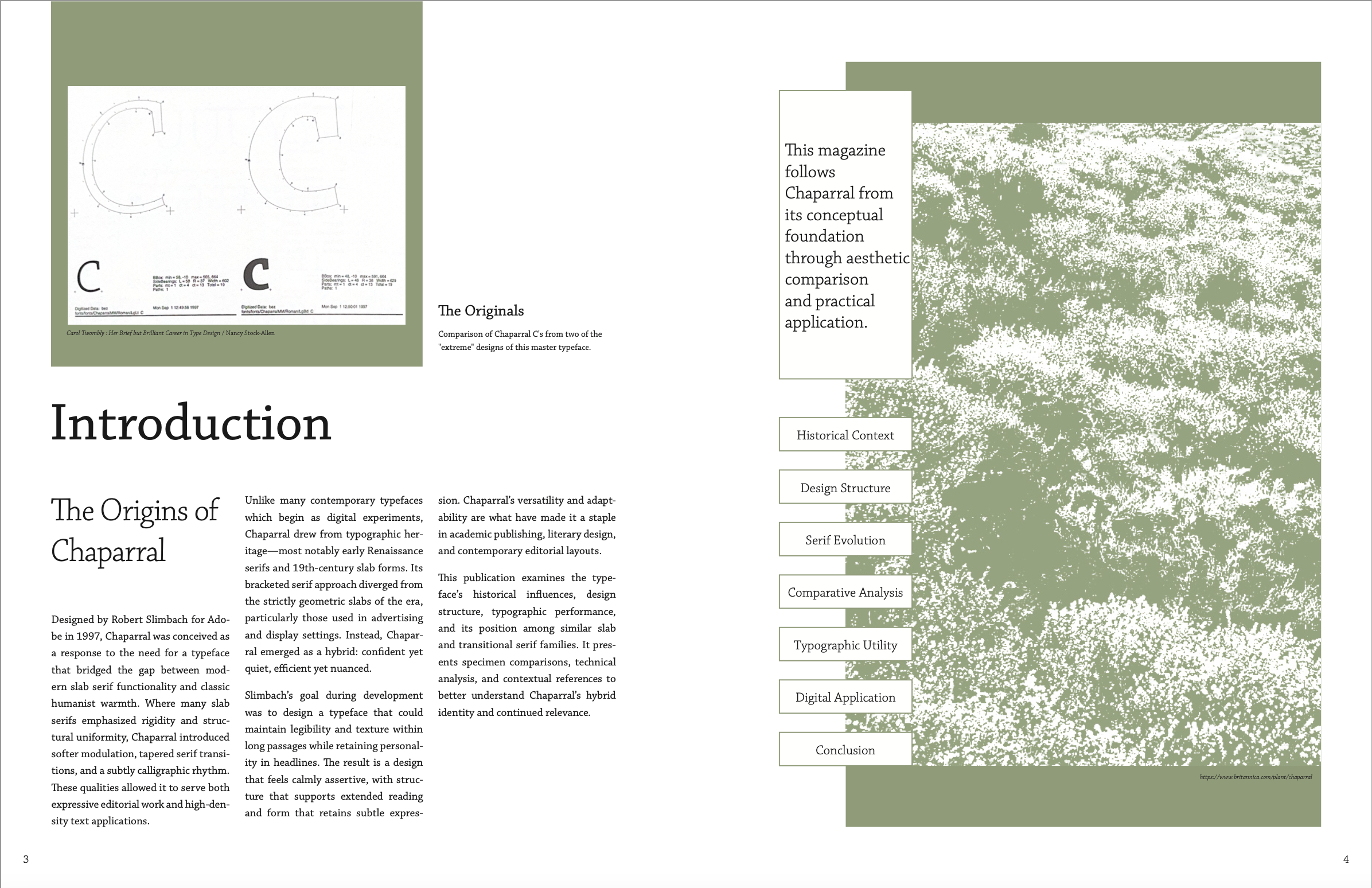
Magazine Layouts
Typeface
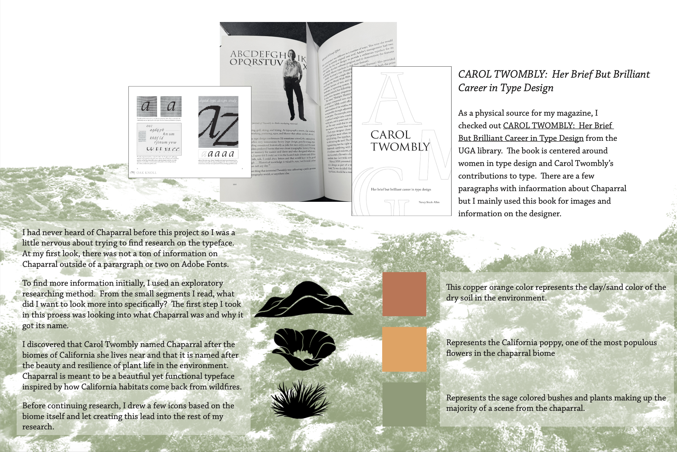
Research
This magazine explores the typeface Chaparral, designed by Carol Twombly. The project looks at the typeface’s history, structure, and modern uses, and breaks down those ideas into a clear, organized mag. Each spread was designed to balance information with visuals, using a consistent theme inspired by the chaparral landscape to tie everything together.
This project required collecting information through research and turned it into a strong visual product using tools like Adobe InDesign and Illustrator. I built grid systems, used typographic hierarchy, and kept branding consistent across multiple spreads while still making each page feel intentional and interesting. It also highlights my attention to detail in layout, typography, and preparing files for print. Overall this project helped me grow my abilities organizing information clearly and creating visually engaging content.